
Skip to content

Product structure logic

Product Structure shows or hides parts — not materials. This page uses a wardrobe door: solid, glass, or no door. Finish View Components first so you can attach each option to the 3D.
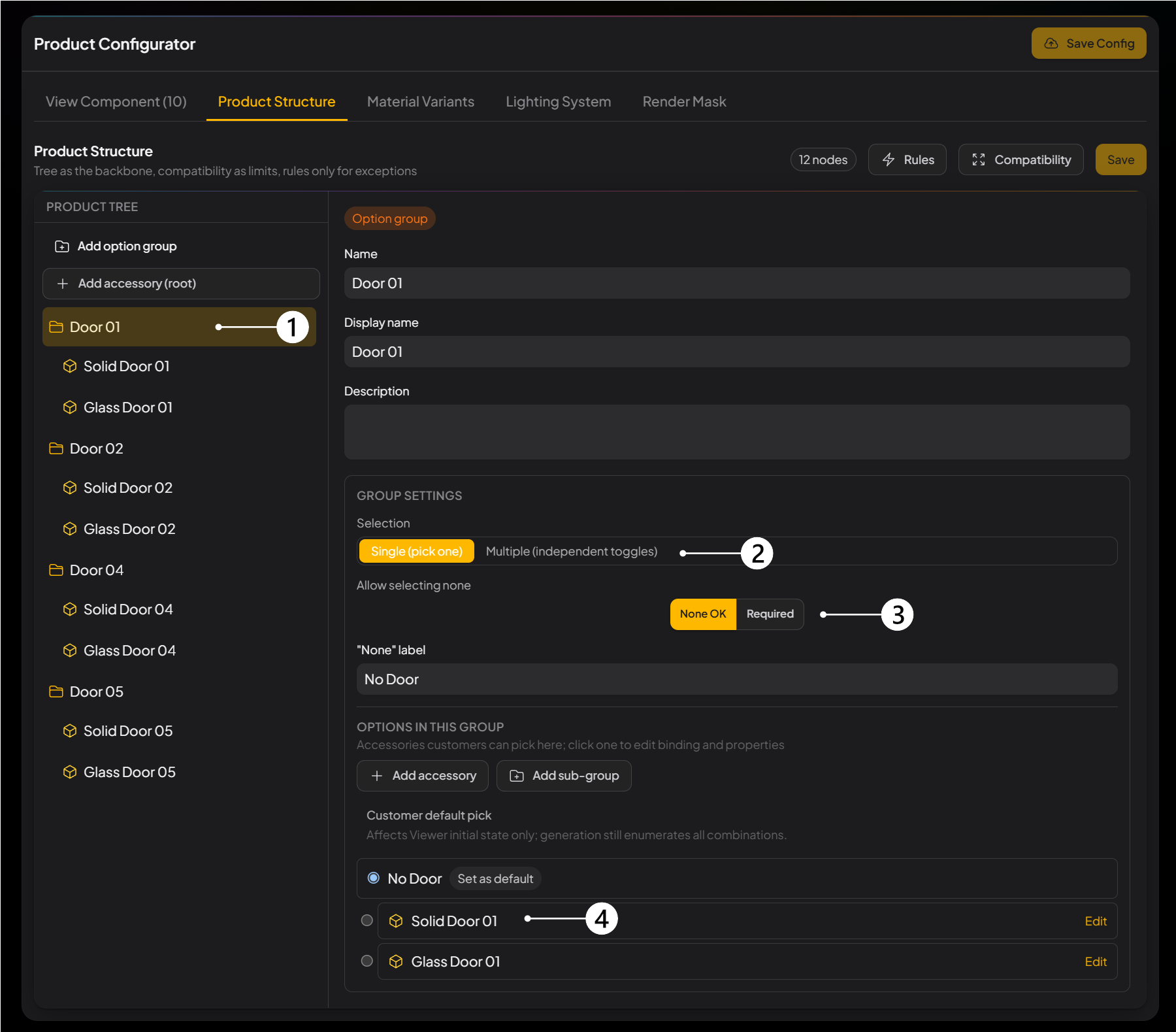
Product Configurator Product Structure tab: Product tree, Selection, Allow selecting none, and Options in this group labeled
Door option group Door 01: single pick, none allowed, default No Door.

Door 01 is one of the wardrobe doors. Solid and glass never appear together — that is Single.

Block What it does
① Product tree The left column is the product’s choices.
  • A folder is an Option group — this door, for example.
  • Items inside are Accessory entries — solid door, glass door.
  • Select Door 01 to open that group on the right.
  • Click Add option group or Add accessory (root) to create a node.
② Selection How accessories in the group exclude each other.
  • Single (pick one): only one shows at a time. Door 01 is single — solid and glass never appear together.
  • Multiple (independent toggles): each accessory can turn on or off on its own.
③ Allow selecting none Whether this group can have no accessory.
  • None OK: no door is allowed.
  • Required: the customer must pick one.
  • If none is allowed, fill the "None" label. Here it is No Door.
④ Options in this group The list the customer can pick from — solid door and glass door in the figure.
  • Click Add accessory, or nest a child group with Add sub-group.
  • Customer default pick only sets what Viewer shows first. Rendering Tasks still run every combination, so a default does not cut the batch.
  • Click Edit to bind the accessory to 3D, then choose whether the customer toggles it or it uses Follow parent.
  • Hang follow parts under an accessory, not directly on a single-pick group.
  • When you finish, click Save.